Custom ListView - ColinTreeListView *
Higher level "ListView", using extensions!
Update on 2019.6.5 (Version 11):
- Added Translations (need platform supporting)
- Fixed a Get method bug by @10MINT
- Added ExtraButtonImage in ColinTreeListViewElement part of work done by @mkakozbeklem
- Removed flag deprecated from all blocks
Update on 2018.7.27 (Version 10):
Update on 2018.3.10 (Version 9):
- Fixed Error of Visiblility
- Added ClearCache(path) & ClearAllCache() -- still in test, it should works
Update on 2018.3.4 (Version 8)
- Fixed extraButtonEnabled not implemented
- Added support of direct(static) functions in ColinTreeListViewElement
Update on 2018.2.25 (Version 7) THANK YOU @User81 FOR SPONSORING:
- Fixed that lastClickedElement starts from 0
- Fixed that images that cached by a same path would act wired when one of them is clicked
- Added a extra button
- Added property handler for every single element of the listview -> useage
Update on 2018.2.11 (Version 6):
- Added properties of text height (both main- & sub-text)
Update on 2018.1.31 (Version 5):
- Added icon text related properties
- Added lastClickedElement & lastClickedIcon
Update on 2017.12.30 (Version 4):
- Adapted to all platforms (ai2.appinventor.mit.edu , thunkable , etc.) There should not more NoSuchMethodError at anywhere.
Update on 2017.12.29 (version 3):
- Adapted to new Appinventor (since 2017.12.27, Companion 2.45) (Fixed NoSuchMethodError)
- Added properties related to image loading - AsyncImageLoad & CacheImage (that in a same path)
- Added property - ScrollBottomAfterAdd
How to use
Left a VerticalArrangement or a VerticalScrollArrangement, set the width and the height as you like.
Here is the sample: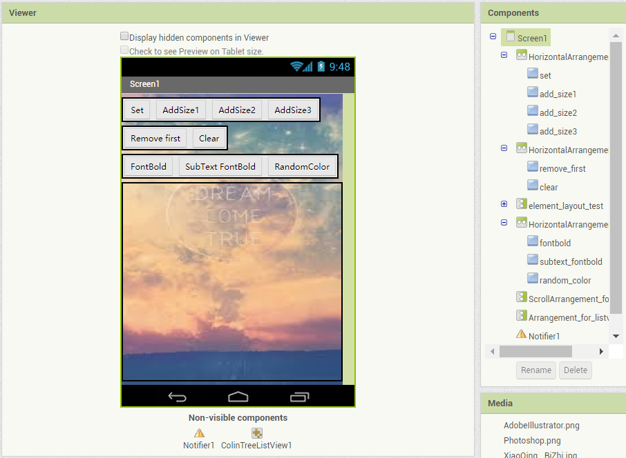
Before do anything like add a element, initialize it first:
Choose only one of the initialize method
Set the list
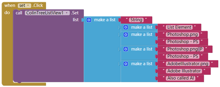
The "set" method required a list, and the list elements can be:- Single text element without icon:
The list element here is just a Text, and it will be shown in the element - Single text element without icon(same with the one above):
A sub-list with only one item is also allowed when creating a Single text element without icon. - Single text element with icon:
The sub-list with two item will be proceed as a Single text element with icon.
The first item is the icon path, when the second one is the text here. - Double text element with icon:
A list with at least three item, is being recognize as a Double text elemtnt with icon. And only the very first three items will be used as the parameters here. They are: icon(path), Main-text, and Sub-text
The three types of list element can exist when a ColinTreeListView is created
Sample code:
Runtime screenshot (IconMultiParams checked):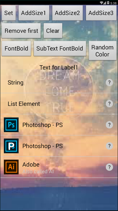
- Single text element without icon:
Events
Element events:
- ElementClick
- related property: LastClickedElement
- ElementLongClick
- related property: LastLongClickedElement
- ElementTouchDown
- ElementTouchUp
- ElementClick
ExtraButton events:
- ExtraButtonClick
- related property: LastClickedExtraButton
- ExtraButtonLongClick
- ExtraButtonTouchDown
- ExtraButtonTouchUp
- ExtraButtonClick
Element icon events:
- IconClick
- related property: LastClickedIcon
- IconLongClick
- IconTouchDown
- IconTouchUp
- IconClick
Methods
List operations:
- AddElement
- AddEmptyElement
- Clear
- Get
- GetElement
- Initialize
- Initialize_Scroll (using the VerticalScrollArrangement)
- RemoveElement
- Set
Element operations:
- SetElement
- SetElementIcon
- SetElementMainText
- SetElementSubText
- SetElementText
Other operations:
- ClearAllCache
- ClearCache
Properties
ColinTreeListView provide the real-time list layout modifing through properties
And the properties are: (the order of the properties cannot be control by code, sorry for the mess here)
- AsyncImageLoad - load image in a asynchronous way
- CacheImage - cache image by file path, in order to avoid wasting time and memory
- ElementHeight - Height of elements
- ExtraButtonBgColor
- ExtraButtonEnabled - default as false, if you need a extra button, please check it (set it to true).
- ExtraButtonHeight
- ExtraButtonImage
- ExtraButtonPaddings
- ExtraButtonShape
- ExtraButtonText - I would not support seting text of extra button of each elements :P
- ExtraButtonTextFontBold
- ExtraButtonTextFontSize
- ExtraButtonWidth
- IconBgColor
- IconHeight
- IconMultiParams - if this is checked, new format (introduced since Version 5)
path||iconTextwould be available. Value likePhotoshop.png||Pwill be displayed as a TextPon imagePhotoshop.png - IconPaddings - for larger space of text displaying
- IconShape - same as one of buttons
- IconTextColor
- IconTextFontBold
- IconTextFontSize
- IconWidth
- ScrollBottomAfterAdd - Scroll to bottom after an element is added - (using delay to make sure listview has been re-rendered)
- SubTextColor
- SubTextFontBold
- SubTextFontSize
- SubTextHeight (-1 for auto, -2 for fill parent)
- TextColor
- TextFontBold
- TextFontSize
- TextHeight (-1 for auto, -2 for fill parent)
- TouchDownColor - Color when element is touch down, default alpha is 136/255, about 53%
- UnderlineColor - An underline is the line between two elements
- UnderlineWidth
- WidthAfterIcon
- WidthBeforeExtraButton
- WidthBeforeIcon
Attached: the color when element is touch down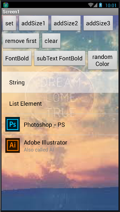
ColinTreeListViewElement
This is a handler for every single element in the listView.
Note: Before use any property, please link to a element by calling LinkToElement
Properties that not exist in ListView:
- UseGlobalProperties - default as False, if you want the properties of this element not to be refresh when the ListView properties changed, please set this to True.
- ElementBackgroundColor
Download
- Last update 2019.6.5 (v11)
- Direct download
- Release info
- binary.zip
- Source Code